Showing posts with label Cards. Show all posts

Saturday, April 17, 2010

Mother's Day is Drawing Near

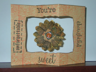
I know Mother's Day is still a few weeks away, but time does fly when you are having fun, and it will be here before we know it. As soon as I completed my Easter cards, I started working on an idea that I had been kicking around for a card design and decided to use it for this year's Mother's Day cards.


This technique allows me to maximize my cardstock paper with minimal waste. Here is the final result of the mock up card. I just could not get my lighting to co-operate.  The card is four sided and stands upright.

So how did I get started? I began with a 12x12 sheet of Fancy Pants double sided paper that had the manufacturing information on the white strip. I cut it in half to get two 6x12 strips with the white piece on the six inch side. I then scored from left to right at 3, 6, 9 and 12 with 12 being on the strip--see left hand side.

I inked all of the edges with Distress Ink and stamped and embossed the flowers so that they would be in the center of my aperture. Queen & Co pearls were adhered to each center.

The overlays were created using the Nestability Labels 6 die. I ran them through a Cuttlebug folder and swiped ink over various parts to bring out the embossed design. I did two panels to be embossed and two panels were debossed. This spices it up a bit, I think.
Next, I prepared the pieces that would go on top of the
embossed/debossed panels.
Below you can get a better view of how this all came together. I finished them off by stacking two flowers together and putting a brad through each and adhering them with the clear glue dots. LOVE those. The mom and cupcake were mounted on low profile foam tabs because I did not want to create too much bulk.


I can see this being used to cover the plain clear bottle that a bouquet of flowers come in or as a pencil/pen caddy. Slide this over the plain container and you have something that Mom or anyone else can enjoy all year long.

How great would this be to cover the holder for your summertime plasticware?  Much cuter on your table than that red plastic cup we all use.

Slide it over that small bottle of handcream/sanitizer that sits on your desk and you will smile each time you reach for it.
 
I created this as a topper if it is not used for other purposes. I added touches of Worn Lipstick Distress ink to this one, and just played around with decorating the Spellbinders Peony.


As always, thanks for stopping by to see what I have been inking. Can I be cheesy and say my ink runneth over? I do put it to good use by swiping it over everything that doesn't move. Keep crafting and inking in the name of love.
Until then.

Wednesday, April 7, 2010

Celebrating Spring


It is that time of the year. Spring has sprung. Except that this year the tree blossoms are coming and going very quickly. Before I have had a chance to get out my camera and capture the Dogwoods (state tree) and Cherry Blossoms in full bloom they are falling to the ground. One of my most cherished times of the year is passing far too quickly. Our area continues to go from summer to spring and back again. Hopefully by May things will have settled a bit and we will have more predictable weather.

This card captures so much of what I love about spring. The feeling of looseness and freshness. We are less confined by heavy outer wear and snow and ice.


This is the completed card which I recently sent to a blog winner along with her set of stamps. It is from the DCWV kit in the pink box currently available at HSN.

This next card is uber cute in its simplicity. I was on an aperture binge and could not stop myself. I used my Spellbinder scalloped circle on this one. I did not get to finish off the card but kept it in my stash for inspiration. 


Taking a look at the components close-up. Everyone knows that I love my Sakura pens and I used them on this card.
The flower stamped on the scalloped
circle was colored in using the meteor pens. It looks like stained glass. Very classy.


 The circle quote was stamped and embossed. I went over the tulip and the dots with the black Sakura glaze pen. Love this cute little stamp.

Since I cannot leave well enough alone, I also outlined this cute bunny with the Sakura black glaze gel pen and filled him in using one of the metallic pens. A regular gel pen was used to achieve his cute little pink ears. I will at some point finish off this card with a ribbon wrap across the top and bottom and send it out to provide cheer for someone.

This card was created using watercolor paper which added a unique texture. I am having a blast playing with everything. When I take out a set of something to craft with, it reminds me of why I made the purchase. I have great ideas for lots of other things, but need more time to work on them.

No matter what I do, it will always be inked with love.
Until then.

Sunday, December 6, 2009

Cuttlebug Holiday Folder: Hanging Ornaments


It's beginning to look a lot like Christmas. We put up our tree Thanksgiving weekend and burn the lights constantly. It does not matter that not one present is under the tree; it is beautiful on its own. I so love this time of the year. People are kinder and more considerate. If we could only have the Christmas spirit year round.

Somewhere along the line, I decided to put together a series of videos showcasing the HSN exclusive Cuttlebug folders from Provo Craft. I will be the first to admit that I ordered them as soon as they were available on the website and I am so glad that I did. I absolutely adore my CB and am glad that the ladies on the QVC Craft Community Forum convinced me that the CB was the die cutter that I needed. That was about two years ago, and I have not regretted the purchase. My only problem now is that I have added to my list of must have items a whole host of CB folders and Spellbinder dies. Yes, just about every die or folder or embossing plate out there will work in this machine. If you search the internet there are a lot of sites which will provide the sandwich formulas for you.

This post takes a look at the Hanging Ornaments Folder. I had the best time playing with this folder and figuring out all of my options. The one that I settled on creating for this video is this lovely blue one. I knew that I wanted a larger card and used my Scor-pal to create lines across the bottom which were folded and allowed me to emboss the card without losing the height. I am still apologizing for the picture quality. These are scanned and in no way show the true beauty of the card. Hopefully, Santa will bring a new camera to me for Christmas, afterall, I have been a good girl. Mostly.


This Denim Blue Distress Ink from Tim Holtz is very serene on this card and the depth that is created just from using the Cut 'n Dry Foam is incredible. I used a Sizzix tree die to cut the aperture in the center. You can achieve the same by folding the card in half and tracing half of the image on the back of your card and then using a craft knife to remove the tree. Save that embossed tree to be used on another card or incorporated into this one as I did.


I used blue pastel glitter on the top of the ornaments and selected every other hanging line to emboss with Ranger snowflake glitter tinsel. I used some of the Flower Soft glue underneath and got a very different effect. I like it.

Inkadinkado stamps was incorporated for my greeting. I used an archival black dye based ink.

Both cards were sprayed with Glacier Glimmer Mist. I hope you can see the difference here.


I am also posting some of the other things I created in the video starting with the Pearlescent Chalks.


I did try chalking the folder itself, but the chalk was not strong enough. Maybe if I used a binder or solution, but I was not willing to risk staining my folder.

It is a bit light due to the scan, but these are the two images that were inked inside of the folder.


Next comes my UTEE card. That one turned out as well as expected. I love using UTEE, but it gets VERY hot because you need the powder to become molten. While it is still liquid you pour on your next layer and heat some more. I think the results you can get are worth the extra effort. Heating from underneath keeps the powder from taking flight.


This is how the card looks embossed in black. The white card did not show up. This is such a cute folder. I will finish out this post by showing the two cards where I played around with some of the Sakura, Fiskars, and American Crafts glitter markers.


Yes, it is beginning to look a lot like Christmas. As I type this post the lovely white stuff is falling and it is beautiful.


It is hard for me to look at a white canvass and not want to ink it. I think if I could, I would take the scene I see outside of my window and take some of the Distressed Broken China, ink the edges and then hit spots with the Black Soot. Then apply an even coat of the Glacier Glimmer Mist over the picture. It will give it that etheral look of mystique to the entire scene. Yeah, I like that.


Please keep Inking in the Name of Love.


Until then.

Wednesday, August 19, 2009

Flower Soft Day 2

Whew. This has been a busy retreat. I am posting the Wishing Well card that I had in the video opener. I changed the background to lavender and stamped some flowers on the side and added some hand drawn elements that I covered with the lovely Flower Soft. If you have not seen the video you can watch it here. If not click FlowerSoftRetreat to view it at YouTube.


You could also create an entire field of flowers and have your Wishing Well as the focal point; place a few clouds and birds in the sky: idyllic. I kept mine pretty basic on the side panels by stamping with Versamark and then using a clear embossig powder. The stems were hand drawn. Here are a few more closeups of those panels.


Now, on to what you all have been waiting for...a sneak peek of the finished beige door card. Before I show that to you I would like to give the code again for the freebie with purchase. When you visit www.cutterscreek.com please enter "5 Free Bags" to receive your empty bags that can be filled with your new purchases and help to keep you contained and organized. Don't forget your toppers and your glue while you are there. These items will get you started and the projects are EASY. Ok. Now. Ready? TADA.......

Isn't this spectacular? When we have completed our project, this will be the end result. Again, you can glue and sprinkle, but look what happens when you dress it up a bit. STUNNING. Here are a few more views of the completed topper with the Flower Soft.
The dimension this product adds without a lot of bulk is incredible. Don't you want to take that snow and have a snow ball fight? Or, make some ice cream?


Before I forget, I also want to mention that there is a yahoo group for www.Cutterscreek.com
You will definitely want to request membership. Kim is famous for interacting with her customers and sponsoring fabulous contest, doing giveaways, providing discounts and all around fun. You can also check out her blog at http://kreativekim.blogspot.com.

It is my sincere hope that you have enjoyed this Flower Soft retreat. Please don't forget to check back for the Day 3 Vee-dio. If there are questions you have that I have left unanswered, please let me know. I enjoyed the journey and can hardly wait until the next time I can add a bit of ink to my projects.
There is a Scarecrow that I need to work on to get ready for fall. That autumn Flower Soft is sounding yummy and calling my name. I had better get busy.

Gotta find some fall ink colors, in the Name of Love of course.

Until then.

Monday, August 3, 2009

The Spinner Card

Hello everyone. As promised I am working furiously to post information about my videos on this blog. I had a fab time creating and playing with this card.
The background is stamped with a HOTP (Hot off the Press) phrase stamp. The other sentiments are from Plaid All Night Media. I overstamped the flower and used brads on both sides. I love the simplicity of the card.

For this next one I went a little lighter and added the adorable flower stamp from KI Memories. The garden embellishements are from a pack of buttons I picked up on clearance from Michaels. I simply removed the button shanks and attached them using my favorite adhesive: Glossy Accents from Ranger. The center flower is three layers with the top one being a flower encased in epoxy.


I was not into complicated measuring and cutting so I formulated a suitable and workable substitute that would allow me to assembly line-- mass produce these cards. I do hope that you give it a try. Following is another take on that same idea. I wanted to use up any remaining embellishments. Waste not, want not.


Can I make the claim that these cards will provide endless hours of enjoyment? I could barely put mine down in order to edit the video. You can find it here.


And this is the trio I produced. When they were on my bookshelf a slight breeze caused them to turn and flutter. Ahhhh. Pure bliss.
Keep creating and inking in the name of love.

Until then.

Sunday, August 2, 2009

Frog Leg Card/Diamond Fold Card


Hello crafters and welcome back to Inkallusions. I am finally getting it together by learning how to portion my time better. I become so involved in what I am doing that I lose all track of time.
I would like to share some 4th of July cards I made to decorate my home this year.


I have taken creative license and renamed the Diamond Fold card to the Frog Leg Card courtesy of my son. At first glance he exclaimed, 'It looks like a frog's legs'. I could not agree more. Thus the christening of this card. Since we were nearing the celebration of the birth of the United States of America, I chose to create something patriotic. These are the results.


I can see this design being used as place cards for the holidays or a rehearsal dinner displaying a photo of the bride/groom to be with the appropriate attendant/parent. What a wonderful keepsake which can be displayed year round. This is what the card looks like when it is flat in the envelope.

Here is a view when it is opened and displayed.

You can watch this video to see how it all came together.

Of course you can create the look of additional layers with the creative use of ink. As always keep inking in the name of love.

Until then.

Sunday, March 22, 2009

The Learning Lab #1--Quick Cards

Hello and Happy Spring!!!!!
On the QVC Yahoo scrappers board one of the members posted regarding 6x6 paper. She wanted to know how else could she use it for other than matting photos. I believe she enjoyed scrapping in 12x12. I have a few 6x6 albums but find that it is limiting for telling complete stories. I would rather devote those to a special event. Her question was exactly the challenge I needed.

In addition, I needed to create some quick cards. That idea evolved into a series of quick cards using 6x6 paper. Here are a few of the photos.

I also created a video demonstrating the project. Since the video exceeded the limit set by Blogger, I uploaded to Vimeo. I sped up the footage and when Vimeo converted the movie, some of the takes became unstable and blurred. I will work tomorrow to separate out the video into two smaller ones.
Until that happens here is the link to see this one.
I hope you will join me again on this blog for more from the Learning Lab. In subsequent posts, I will focus on each of the cards and share some of the elements and techniques used to create them.

Keep Inking In the Name of Love.
Until then.

Tuesday, March 17, 2009

Happy St. Patrick's Day --The Shamrock

What would St. Patrick's day be without the lucky four leaf clover? I recall searching endlessly for these as a young girl.

My friends and I would toil for hours in fields of green seeking the elusive clover. During my lifetime, I have been able to find 4- four-leafed clovers. They had a home in the family Bible--not sure where they are now.

This card pays homage to the shamrock. I used more of the Studio G stamps on this one. The flowers are Prima and the ribbon from Michaels. I was supposed to have written March 17th inside the box or the words everyday. Still had not made up my mind before snapping this photo. Love the shamrock stamp.

Speaking of the Shamrock.

Information from http://www.history.com/

The shamrock, which was also called the "seamroy" by the Celts, was a sacred plant in ancient Ireland because it symbolized the rebirth of spring. By the seventeenth century, the shamrock had become a symbol of emerging Irish nationalism. As the English began to seize Irish land and make laws against the use of the Irish language and the practice of Catholicism, many Irish began to wear the shamrock as a symbol of their pride in their heritage and their displeasure with English rule.

Talk about using color to express your beliefs is in line with Inkallusions. Nothing positive happens unless it is done with love.

Always Ink in the Name of Love.

Until then.

Sunday, March 8, 2009

The Brown Series Three

Hello again. This is card number three in the series. One more to go and then we can move on to some other creative ideas. I wanted to show how you can take the same basic design and put a twist on it. This is a great way to maximize that left over paper. Or you can start with a 12x12 sheet and cut it down. Done properly you can get at least 16-20 cards completed without skimping on the materials. Hmmm. That gives me ideas for my next few posts.


Still using the invitation remnants I again stamped the Fiskars quote onto the orange cardstock and inked the edges. This time I carried the background swirl stamp onto the quote. It was then adhered to the brown paper--all Bazzill. On this photo you can see where I used a fantastic swirl stamp from Little Yellow Bicycle. I applied three different shades of ink to the stamp and did primary and secondary generation stamping to achieve this effect. I absoloutely adore this stamp set. You will see more of these images on cards and scrapbook pages I create.


To add more creativity I ran the three tabs through a Cuttlebug folder. Then I used the tourquoise/blue ink and swiped it over the raised portions. This really made the images POP.


I was excited to use some new Petaloo flowers I received. I layered an orange and soft blue felt flower over the polka dot to tone it down a bit and adhered the entire ensemble together with a brown brad. The polkas mimic the dots found on the three squares cardstock at the bottom of the card.

I had so much fun testing my creativity with this series. I really like the randomness and the free form of this card. This also gives me designs for my arsenal. They are simple enough to be mass produced in a short amount of time. They can easily be turned into anniversary, sympathy, get well or whatever card with a simple switch of the quotes.


The final card in the series is cute if not totally unique. Look to find it here in a few days. Maybe over the weekend if I get ambitious.

Of course it is inked with lots of love. Why bother to ink, if it is not Inked in the Name of Love.

Until then.