Showing posts with label Tim Holtz Distress inks. Show all posts

Wednesday, November 10, 2010

CropChocolate Online Crop: Challenge 6

Ok, I have to admit that this one was probably my favorite challenge. When I participate in these events, I want to produce something that I can use or send out to someone. The cards made in my Vee-dios are sent out to people, unless they go terribly awry, then I cut them up to make something else. 

This challenge was to create a Thankful Journal. You could make one of your own, directions were provided, or you could alter the front of your binder or notebook. I chose the latter. 

I purchased this black journal quite some time ago. Always with the intentions of enhancing it somehow. This crop challenge provided the perfect opportunity. 


The label is of the easy peel off variety. My hands were itching to remove it and get started. So first I pulled out a stash of potential materials to use.


I sat and stared at everything for a bit, wondering where to start. Then I remembered a layout by Sue Wilson that really appealed to me on some level. I took several of her elements and pulled them into my interpretation. I pulled out my Basic Grey Ambrosia paper pack and selected a few sheets, some stamp images, alphas, and sayings, Spellbinder dies and a few other things I thought I might press into service.


After much cutting, trimming and inking, I was left with this incredible journal in which to record my thoughts and actions on being thankful and showing my gratitude to those who help me.


All of the papers are from the Basic Grey Ambrosia collection. I just love the warmth of the colors in this line. It is reminiscent of India to me. The patterns are awesome and there is such a nice mix.

I used several Spellbinder dies: Beaded Ovald, Labels 10 and Labels One and the Classic Oval. I inked the edges of the dies with Distress Ink, dipped them in clear embossing powder and heat set the powder.
The large background oval was cut from a Fiskars large oval template. I used the Martha Stewart corner Family punch to go around the oval.


Once that was completed I pulled out a variety of Tim Holtz Distress Inks and used those to enhance the oval. I also used an Inque Boutique swirl stamp and used the Distress Inks with it. My son caused me to drop my ink pad on the oval, and I covered that with the Labels One Nestability die.


I used the Nestabilities as a template and traced the outside rim to get a smaller border around my pieces.


I stamped Be Thankful and Gratitude using an Inkadinkado harvest set. Embossed and heat set them and then went over them with my Sakura black gel pen. Will have to tell you the story about how I destroyed my embossing gun. Yep, melted that sucker right on down. But I digress. I glued the two pieces together using my ATG. At this point I used my Ranger white gel pen to place decorative dots around each cut's narrow frame.


The Bible quote was computer generated. I cut it using a Spellbinder Classic Oval die so that it would fit on top of the beaded oval die. I inked the inside edge with Tumbled Glass. I added some bling to the black beaded oval by 'painting' the beads with my embossing pen and then painting on some gold Pearl Ex powder. I did set the faux beads with a fixative.


At this point it was time to layer all of the pieces. The punched family went down first. Then I placed the Labels One die, then the Labels 10 die and finally the quoted piece. I thought about tying a ribbon and adding pearls or rhinestones or dew drops to the points between the family but opted not to do so. I like the look of this journal.


Yippee, got to use my inks. I am very thankful to Tim Holtz for dreaming of and then ultimately creating this wonderful line of inks.
In the name of love of course.
Until then.

P.S. The final challenge, #7, was hosted by Laura. You will have to return to see my take on her challenge project.

Sunday, November 7, 2010

CropChocolate Challenge #3

This challenge was to create an Easel card. I have done several of those and did a really cute one for a summer challenge. I was scrambling for a 'new' idea for this one and decided to do a dinner invitation. I had considered doing a menu card for the actual dinner, but was getting a bit tired and wanted a stamp plain and simple. Here are the results.


I wanted a bit of flair for the card so I used the Spellbinders Mega curved rectangle dies for the project.

I first cut the base card at 4 1/2" by 12" and scored and folded it in half. The die I am cutting with measures 4 inches. This will make sure that the entire card gets cut.


I used the largest die for this project and placed the folded card with the fold just underneath the cut line at the top. This will ensure a connected card once it has been cut.


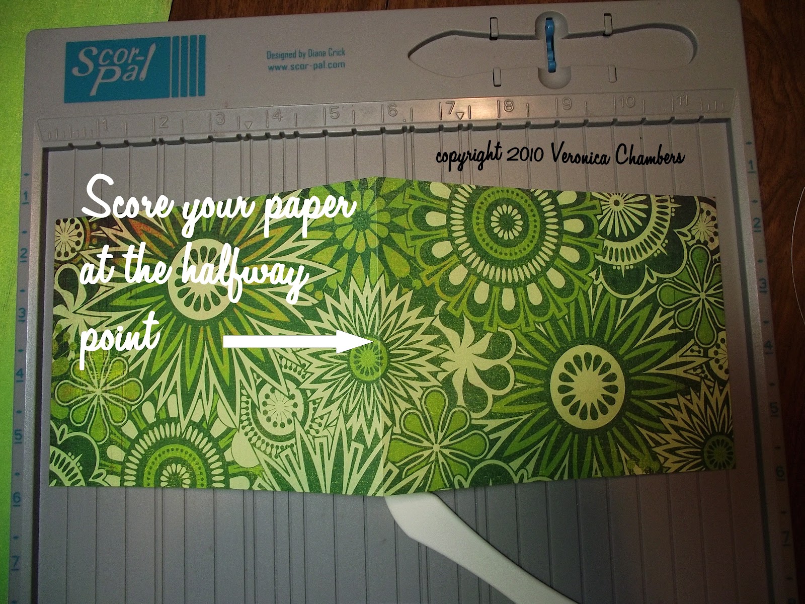
After cutting the base card, I went to my score board and scored on the halfway mark of just one of the rectangles.


Since the Basic Grey Lime Rickey paper is one sided, I decided to cover the bottom portion with a coordinating piece of card stock to cover the white. I placed it just shy of the cut lines so that it would be the same size as the card. I inked the white base just in case my gluing went awry.


Then I cut the base layer piece out of a single sheet of green paper using the die just one size down. I then embossed with a Sizzix folder and used Peeled Paint Distress Ink to bring out the embossing. I used a cut n dry foam pad and gently swiped over the raised portions.


Next in line was the frame for the rectangle. I used a magnetic sheet I have to hold the two rectangles in place to get an evenly cut frame. I then put that through the Snowflake Cuttlebug folder.

I also cut a large rectangle from the patterned paper for the standing piece. 

The next size down was cut for the stamping of the invitation. This was done on white card stock and edged with green and yellow inks. The Martha Stewart Dinner stamps were used. The green ribbon is simply there to hide a boo-boo. ooooppppssss.

Here are all of the components of the card.


All pieces were distressed with Shabby Shutters ink. Foam dots were placed under the frame to give some depth.


 Now it is time to apply the standing piece to the card base. Remember that you are only gluing down half of the card. Only apply adhesive to the bottom portion of the card.


Glue the solid green piece to the bottom of the base card. Your card is now completed. The texture on the card and the base piece keeps the card standing. 


If you want extra support stamp and cut out another element and adhere that about 1/3 from the edge of the base card. This will help the standing card stay in place.


It is now time to see if I can complete at least one more challenge. I have so much other work to do today that it might not happen. If it does, I will be certain to post it here.
Of course loaded with lots of ink.
Until then.

CropChocolate Challenge #1

CropChocolate.com is having their online crop this weekend and I have been feverishly trying to complete the projects, update it to my blog and give my DS some mommy time. It is a lot but I think I am doing ok. 
I have two completed projects and would like to share them here.

Challenge #1 was to complete a layout based on an advertisement. 


I have to admit that upon first glance this layout did not inspire me to do anything but wait for the next challenge. Since I had planned to participate, I decided I had best get my thinking cap on. I had some fall photos of DS from 2005 that  I had been planning to scrap for Lyn's fall challenge (never did) so I thought it is now or never. This is my take on the inspiration piece. 


The paper I had planned to use was from the Karen Foster Designs Autumn pack. I selected the paisley print as my background although it is paper weight. 
 
I took that to the ScorPal to imitate the grid lines on the inspiration piece.  I started with a half inch border on all sides and then divided the sections. I edged all of the lines using Memories Direct black pigment ink cube. 


The inspiration piece had what appeared to be a watermark title in the background and I decided to imitate that by stamping AUTUMN. I used the KI Memories alphabet stamps along with Tim Holtz Aged Mahogany Distress Ink which I embossed with clear embossing powder. This was my first time using the Fiskars stamp press and I think I like it. My entire word would not fit so I had to stamp the U and the N separately. Then I took the entire piece and misted it with Glimmer Mist Red Suede. While I was at it I misted the two mulberry leaves.


Next I needed to prepare my photos. After measuring the inside squares and rectangles I cut my photos down to size. I decided to mat only one of them. I cut the striped paper, distressed the edges with my scissors, inked them with Memories Direct red ink cube, dipped each side in clear embossing powder and heated it. I cut a complementary circle for the geese and sprayed with Red Suede. I then edged the circle with Aged Mahogany.


After affixing my photos I went back into that same fall stash to find embellishments suitable for the layout.


The rubon letters were perfect for this piece. I used the corner photos to bring cohesion to the date. Speaking of the date I used the black sticker letters that came with the kit. The glittery stickers are from Miss Elizabeth's (the brand sold at the Dollar Tree). I added red rhinestones to the page title and the flower and acorn cluster.


The rest of the rubons were placed where I felt they had the most impact. I love this set from Karen Foster. This is a well-put together kit. I really did not have to go outside of what was available to make a delightful fall layout.


I love this quote:  "Mother Nature's favorite season".


I love this challenge in that for no other reason, it got me to crop those fall photos from five years ago. That is the beauty about not doing chronological scrapping. I can scrap whatever photos suit the moment. Out of the hundreds that I take only a select few are actually printed. From that I narrow it down to five for a page layout--one or two page. 

Well, I am off to work on the next challenge. It is an Easel Card. Sure wish I could have submitted the one I did over the summer. It was a Shaker/Easel card. Oh well, this one will get me thinking outside of the box also.

Of course it will be lovingly done in ink.
Until then.