Showing posts with label Basic Grey. Show all posts

Sunday, May 1, 2011

CropChocolate Design Team May Layout

Hello everyone. I wanted to share with you the project I created for CropChocolate. I had purchased one of their Basic Grey grab bags and grabbed the Obscure Collection. Can I say that this is the one I did NOT want? I had to find a way to be creative with it and make the collection work for me. This is what resulted.


I started by preparing my photos and their mats. I cut using the largest label and then drew around the outside of the die to get the layering mat. I roughed up the edges and used Walnut Stain Distress ink.


Three different Martha Stewart punches were used to add accents to the layout.


This is what it looked like prior to adding in the torn black cardstock. All of the other paper is Basic Grey.


The photos were layered on top of the black. I used a white pen to add stitch lines around the bottom of the photos and to write the date.


The letters are also from the collection and I added dots to one side of them just for a little bit of pizazz since it was sitting on the black and looking a bit dull.


I used the arrow on the right with the dots on the opposite side to push your eye back to the finished design.


This was definitely work for me on this one. I wanted to only feature the collection. On that note Mission Possible and Accomplished. I was so jazzed that I pulled five more photos that I plan to use for 2 two-page layouts using Obscure. 


Until then.

Wednesday, November 10, 2010

CropChocolate Online Crop: Challenge 6

Ok, I have to admit that this one was probably my favorite challenge. When I participate in these events, I want to produce something that I can use or send out to someone. The cards made in my Vee-dios are sent out to people, unless they go terribly awry, then I cut them up to make something else. 

This challenge was to create a Thankful Journal. You could make one of your own, directions were provided, or you could alter the front of your binder or notebook. I chose the latter. 

I purchased this black journal quite some time ago. Always with the intentions of enhancing it somehow. This crop challenge provided the perfect opportunity. 


The label is of the easy peel off variety. My hands were itching to remove it and get started. So first I pulled out a stash of potential materials to use.


I sat and stared at everything for a bit, wondering where to start. Then I remembered a layout by Sue Wilson that really appealed to me on some level. I took several of her elements and pulled them into my interpretation. I pulled out my Basic Grey Ambrosia paper pack and selected a few sheets, some stamp images, alphas, and sayings, Spellbinder dies and a few other things I thought I might press into service.


After much cutting, trimming and inking, I was left with this incredible journal in which to record my thoughts and actions on being thankful and showing my gratitude to those who help me.


All of the papers are from the Basic Grey Ambrosia collection. I just love the warmth of the colors in this line. It is reminiscent of India to me. The patterns are awesome and there is such a nice mix.

I used several Spellbinder dies: Beaded Ovald, Labels 10 and Labels One and the Classic Oval. I inked the edges of the dies with Distress Ink, dipped them in clear embossing powder and heat set the powder.
The large background oval was cut from a Fiskars large oval template. I used the Martha Stewart corner Family punch to go around the oval.


Once that was completed I pulled out a variety of Tim Holtz Distress Inks and used those to enhance the oval. I also used an Inque Boutique swirl stamp and used the Distress Inks with it. My son caused me to drop my ink pad on the oval, and I covered that with the Labels One Nestability die.


I used the Nestabilities as a template and traced the outside rim to get a smaller border around my pieces.


I stamped Be Thankful and Gratitude using an Inkadinkado harvest set. Embossed and heat set them and then went over them with my Sakura black gel pen. Will have to tell you the story about how I destroyed my embossing gun. Yep, melted that sucker right on down. But I digress. I glued the two pieces together using my ATG. At this point I used my Ranger white gel pen to place decorative dots around each cut's narrow frame.


The Bible quote was computer generated. I cut it using a Spellbinder Classic Oval die so that it would fit on top of the beaded oval die. I inked the inside edge with Tumbled Glass. I added some bling to the black beaded oval by 'painting' the beads with my embossing pen and then painting on some gold Pearl Ex powder. I did set the faux beads with a fixative.


At this point it was time to layer all of the pieces. The punched family went down first. Then I placed the Labels One die, then the Labels 10 die and finally the quoted piece. I thought about tying a ribbon and adding pearls or rhinestones or dew drops to the points between the family but opted not to do so. I like the look of this journal.


Yippee, got to use my inks. I am very thankful to Tim Holtz for dreaming of and then ultimately creating this wonderful line of inks.
In the name of love of course.
Until then.

P.S. The final challenge, #7, was hosted by Laura. You will have to return to see my take on her challenge project.

Sunday, November 7, 2010

CropChocolate Challenge #3

This challenge was to create an Easel card. I have done several of those and did a really cute one for a summer challenge. I was scrambling for a 'new' idea for this one and decided to do a dinner invitation. I had considered doing a menu card for the actual dinner, but was getting a bit tired and wanted a stamp plain and simple. Here are the results.


I wanted a bit of flair for the card so I used the Spellbinders Mega curved rectangle dies for the project.

I first cut the base card at 4 1/2" by 12" and scored and folded it in half. The die I am cutting with measures 4 inches. This will make sure that the entire card gets cut.


I used the largest die for this project and placed the folded card with the fold just underneath the cut line at the top. This will ensure a connected card once it has been cut.


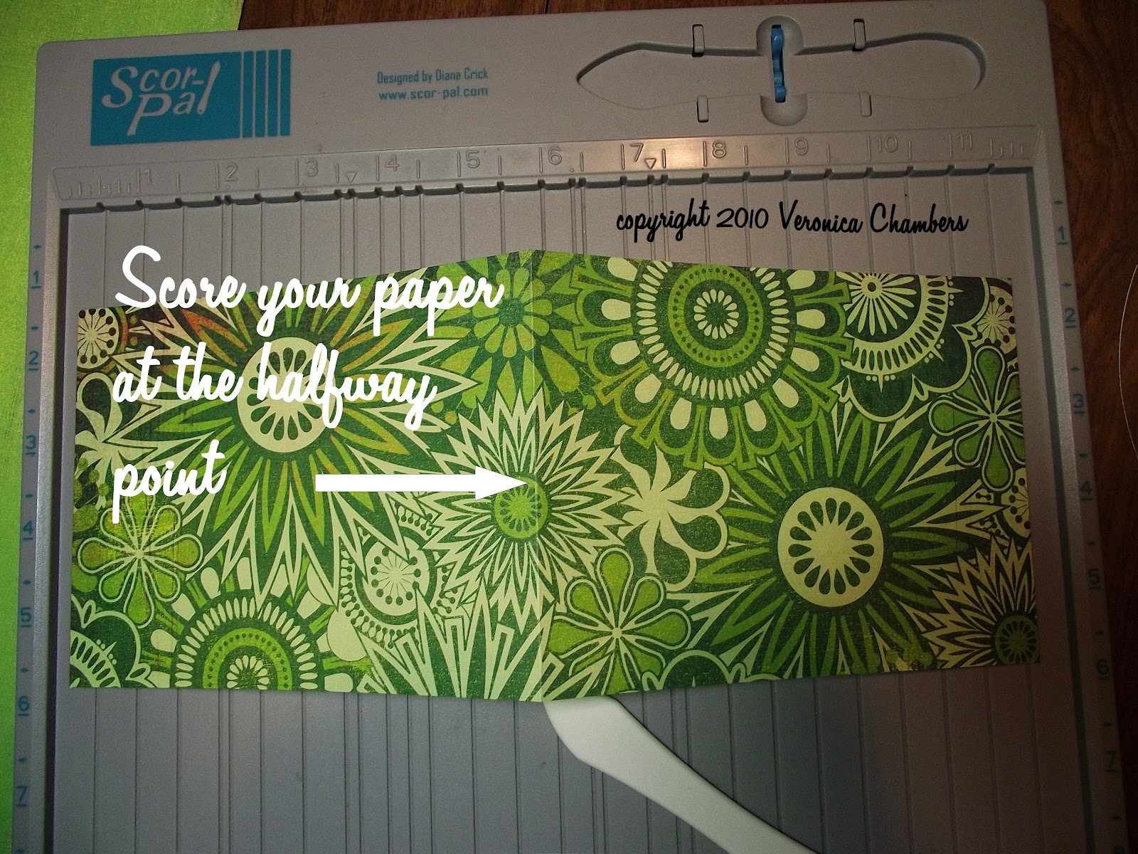
After cutting the base card, I went to my score board and scored on the halfway mark of just one of the rectangles.


Since the Basic Grey Lime Rickey paper is one sided, I decided to cover the bottom portion with a coordinating piece of card stock to cover the white. I placed it just shy of the cut lines so that it would be the same size as the card. I inked the white base just in case my gluing went awry.


Then I cut the base layer piece out of a single sheet of green paper using the die just one size down. I then embossed with a Sizzix folder and used Peeled Paint Distress Ink to bring out the embossing. I used a cut n dry foam pad and gently swiped over the raised portions.


Next in line was the frame for the rectangle. I used a magnetic sheet I have to hold the two rectangles in place to get an evenly cut frame. I then put that through the Snowflake Cuttlebug folder.

I also cut a large rectangle from the patterned paper for the standing piece. 

The next size down was cut for the stamping of the invitation. This was done on white card stock and edged with green and yellow inks. The Martha Stewart Dinner stamps were used. The green ribbon is simply there to hide a boo-boo. ooooppppssss.

Here are all of the components of the card.


All pieces were distressed with Shabby Shutters ink. Foam dots were placed under the frame to give some depth.


 Now it is time to apply the standing piece to the card base. Remember that you are only gluing down half of the card. Only apply adhesive to the bottom portion of the card.


Glue the solid green piece to the bottom of the base card. Your card is now completed. The texture on the card and the base piece keeps the card standing. 


If you want extra support stamp and cut out another element and adhere that about 1/3 from the edge of the base card. This will help the standing card stay in place.


It is now time to see if I can complete at least one more challenge. I have so much other work to do today that it might not happen. If it does, I will be certain to post it here.
Of course loaded with lots of ink.
Until then.

Wednesday, May 26, 2010

Crop Chocolate Designs: Card


You know when I received the email from Crop Chocolate saying that I had a package on the way, I was thrilled; then I panicked. I thought what in the world will I create. After my box arrived I just stared at the contents for a few days until I bonded with the items. One by one they started to speak to me. My first project was this lovely card. I happened upon the quote by chance and the Granola heart was perfect for it. I love the natural look of the chipboard and it went well with the Noteworthy Hillary Lace paper that came in my kit. During the material gathering process, I selected some items that I thought would complement the chipboard.


I went into my stash and pulled the perfect color of textured Bazzill paper that I used for the card base. I rounded the edges and inked them with blue pigment ink and then embossed it using clear embossing ink. I then cut the
two remaining pieces of paper--pattern and the solid using Spellbinders curved rectangles. I inked all of the edges with brown pigment ink. The quote and it's layer were cut with Spellbinders  Labels 4 and did the same inking technique.

I stamped the quote using brown pigment ink and clear embossing powder. A quick blast with the heat gun and I was ready to begin assembling the card. As you can see from the photo, I narrowed my selection of embellishments. I decided not to add the fibers Basic Grey (Scarlet Letter).


I placed the solid green piece onto the base card and then layered the flowered piece on top. The final two pieces, the quote and the green die cut piece were assembled and then raised a bit on foam dots.


The Granola chipboard appears to frame the quote and guides your eye. The line is completed on the other side with the smaller embellishment. As a final touch I adhered various sizes and colors of Queen&Co pearls to the rounded end of each stalk. This card has a very organic feel to it and I like that.

It is hard for me to create a project that does not include stamping and inking. I took this one a step further and used my technique of embossing the inked edges. It adds umph without taking center stage.

Thanks again for stopping by and always continue to ink in the name of love.
Until then.

Wednesday, May 19, 2010

Crop Chocolate Designs: Nature


This layout definitely fits its title. My son loves the outdoors and trying to see what he can discover. This is a small park near city hall and just up the street from our family dentist. We had lunch in the park and of course he took time to explore. I had my camera and was able to capture the moment. I used the photos to design a project for www.CropChocolate.com.

I started by inking the 8x8 base with brown around the edges to create a slight distressed look. This striped piece if the other side of the double sided Making Memories Hillary Lace Flower. Isn't it neat? I love the boldness of it.


Then I cut the Making Memories blue Watercolor Collection (Ocean Simple Sponge) paper to 4x8 and inked around the edges with blue ink using a cut n dry foam pad for a softer look. Using my craft mat makes this job easier.

Basic Grey Fiber ribbon was adhered to the back and brought around to the front and tied into a knot set off center to the right.


This is the 8x8 page with inked edges, middle layer inked and fibers attached and tied at the top. This creates the base for the remainder of the project.


Close up of quote embellishment.

I used the adhesive back Basic Grey Granola chipboard for the title and added additional chipboard elements for the frame and as accent pieces. There is a companion page showing us having our lunch in the park. That is the page that will contain the journaling.

What amazed me was being able to get in three photos to help tell the story. Simple and quick. That is my kind of crafting. 

No matter if it is fast or you labor for days, just make sure you ink it with love.
Until then.