Wednesday, May 26, 2010

Crop Chocolate Designs: Card


You know when I received the email from Crop Chocolate saying that I had a package on the way, I was thrilled; then I panicked. I thought what in the world will I create. After my box arrived I just stared at the contents for a few days until I bonded with the items. One by one they started to speak to me. My first project was this lovely card. I happened upon the quote by chance and the Granola heart was perfect for it. I love the natural look of the chipboard and it went well with the Noteworthy Hillary Lace paper that came in my kit. During the material gathering process, I selected some items that I thought would complement the chipboard.


I went into my stash and pulled the perfect color of textured Bazzill paper that I used for the card base. I rounded the edges and inked them with blue pigment ink and then embossed it using clear embossing ink. I then cut the
two remaining pieces of paper--pattern and the solid using Spellbinders curved rectangles. I inked all of the edges with brown pigment ink. The quote and it's layer were cut with Spellbinders  Labels 4 and did the same inking technique.

I stamped the quote using brown pigment ink and clear embossing powder. A quick blast with the heat gun and I was ready to begin assembling the card. As you can see from the photo, I narrowed my selection of embellishments. I decided not to add the fibers Basic Grey (Scarlet Letter).


I placed the solid green piece onto the base card and then layered the flowered piece on top. The final two pieces, the quote and the green die cut piece were assembled and then raised a bit on foam dots.


The Granola chipboard appears to frame the quote and guides your eye. The line is completed on the other side with the smaller embellishment. As a final touch I adhered various sizes and colors of Queen&Co pearls to the rounded end of each stalk. This card has a very organic feel to it and I like that.

It is hard for me to create a project that does not include stamping and inking. I took this one a step further and used my technique of embossing the inked edges. It adds umph without taking center stage.

Thanks again for stopping by and always continue to ink in the name of love.
Until then.

Saturday, May 22, 2010

Crop Chocolate Designs: Masterpiece

I am sorry to say that I have been quite lazy as of late. Have several projects to video and post, but I have been catching up on my reading instead. Just finished Corpse Suzette. I will be back in the saddle soon. To ease my conscience I am sharing another of my designs for www.CropChocolate.com.

This posed the greatest challenge. I was using the papers that were sent in my kit and wanted to incorporate some of the fibers. After staring at it for a bit, I pulled out my stamps and some ink. I know, shocked aren't you? I cut down this 12x12 piece to create an 8x8 page. These polka dots are on back side of the 5th Avenue Sophia Harlequin paper used on the Green Calendar. The extra bits were used on another project. Waste not want not.

I used a small stamp to create a border around the polka paper. I tried to center each flower over one of the polka dots. Those flowers in the center were my test flowers. I knew the center would be covered by the photo. This gave me an idea of how the ink would react and how much pressure to use to get the look I desired.


The flowers from a glitter kit offered by CropChoc were used to add a border to the right. My own fine pee wee glitters were used on the transfers. I also cut a piece of Bazzill card (leftover from the Greeting Card) to use for my journaling and inked the edges in blue.

This is a photo of the glittered flowers and the quote added to the bottom of the page. It is a Heidi Swapp quote that I cut apart to make it work on my blue strip. My camera catches great detail, but the cut lines are not obvious to the naked eye.


I finished the flowers by adding a dot of liquid pearls to the center of each one. These small dots help each flower make an impact individually and collectively. You are also seeing a sneak peak of the Basic Grey fiber that was used. The color was perfect for the cardstock.

 
 When I created the mat for the photo using the Making Memories Kids collection Ethan Plaid, I inked the edges in blue. I then adhered the fiber and secured it with a glue dot.
The entire piece is raised on two sets of foam dots so that the journaling can be hidden behind the photo. When you are doing smaller pages with larger photos, it is sometimes difficult to find a place for the journaling.


 This is a nice close up of how all of the elements came together. I am not usually the subject of my scrapbook pages. Once I saw the colors of the papers, I knew I had the perfect photo.  Although the design is very simple, I am loving the non-cluttered look of the elements. Everything has texture, but it is soft and fitting for the photo. This one did not make the CropChoc page, but I am pleased with it. My journaling for this was about how I used myself as the focal point in a design and how freeing I felt after doing so.

My inking was kept to a minimum but, it is there nontheless. Each page for me does not have to be over the top. If I like it, then it is a winner.
Keep inking in the name of love.
Until then.

Wednesday, May 19, 2010

Crop Chocolate Designs: Nature


This layout definitely fits its title. My son loves the outdoors and trying to see what he can discover. This is a small park near city hall and just up the street from our family dentist. We had lunch in the park and of course he took time to explore. I had my camera and was able to capture the moment. I used the photos to design a project for www.CropChocolate.com.

I started by inking the 8x8 base with brown around the edges to create a slight distressed look. This striped piece if the other side of the double sided Making Memories Hillary Lace Flower. Isn't it neat? I love the boldness of it.


Then I cut the Making Memories blue Watercolor Collection (Ocean Simple Sponge) paper to 4x8 and inked around the edges with blue ink using a cut n dry foam pad for a softer look. Using my craft mat makes this job easier.

Basic Grey Fiber ribbon was adhered to the back and brought around to the front and tied into a knot set off center to the right.


This is the 8x8 page with inked edges, middle layer inked and fibers attached and tied at the top. This creates the base for the remainder of the project.


Close up of quote embellishment.

I used the adhesive back Basic Grey Granola chipboard for the title and added additional chipboard elements for the frame and as accent pieces. There is a companion page showing us having our lunch in the park. That is the page that will contain the journaling.

What amazed me was being able to get in three photos to help tell the story. Simple and quick. That is my kind of crafting. 

No matter if it is fast or you labor for days, just make sure you ink it with love.
Until then.

Saturday, May 15, 2010

Crop Chocolate Designs: Green Calendar

Hello everyone. I am not sure how many of you shop at www.CropChocolate.com but there are a lot of goodies to be found and at rock bottom prices. You have the option of holding your items in your 'la carte' until you reach a total that will allow free shipping.

There was a recent call for customers to create some designs using their products. I was among many of those selected. Although my pics have been up at CropChoc I never got around to posting them to my blog. I created several projects and a few of which can only be seen here.


My favorite was the calendar I created using a photo taken of my son at a studio. After distributing as many as I could, I had to figure out what to do with the rest. This is a great use for them. Here is how it all came together.

White Sakura gel pen used to create faux stitching around the 8 x 12 inch base. I simply drew these freehand and tried to make sure that the corners were even.
Next, the green base was stamped in various muted ink colors with one of the flower stamps used to create the embellishments on the final piece. Since I was covering the center of the base, I used that area to test my flowers.  
Photo was matted to black paper with a faux stitching using a Sakura white gel pen. Then that was matted to a patterned piece leaving a two inch border at the bottom to add some journaling or a quote.


Stamped Fancy Pants flower and heat set using the green cardstock. I used a swirl stamp in the background to give the flowers some variety and a bit of texture.


This Making Memories 5th Ave patterened piece was cut to 4x12, inked around the edges in red and adhered on top of the flowers and the faux stitching.

This is a better view of all the elements together.  A hand-made calendar has been added along with the matted and layered photo with a quote at the bottom. Two Basic Grey Granola chipboard embellishments have been added also.


Primary brads were used as the center for the flower images and mounted on to foam dots for dimension. You don't see the faux stitching here, because this was taken during the planning process.


The flirty letters were used and over-inked with black ink to bring down the color.

Flowers have been added to the scroll swirls and around the photo.


 I really like this idea of using those leftover photos to make calendars. Once the month has passed the calendar can be adhered to a full 12x12 piece of cardstock and placed into an album. The extra four inches at the bottom can contain numbered items that happened during the month which will correspond to the day. You get double duty for your scrapping.

Working on these projects really got me to think in different ways. This one certainly gives you bang for your buck.

It would not be mine if it were not inked in some way. I just can't resist. Why the red you ask? It is my son's favorite color, so I had to try and incorporate a bit.

Keep crafting and inking in the name of love.
Until then.

Sunday, April 25, 2010

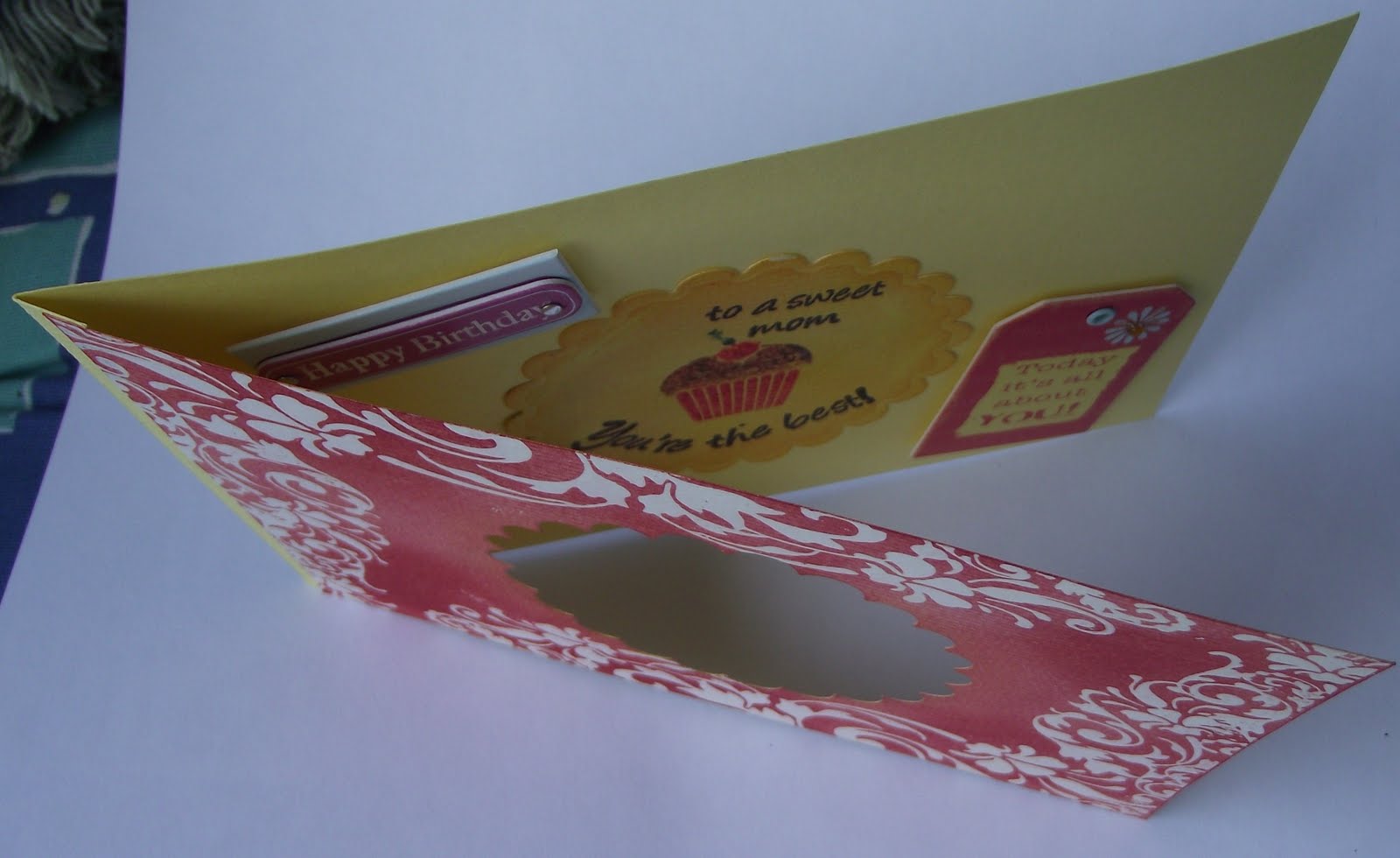
Happy Birthday, Mom

My mother celebrated her #?? birthday last week. Since I knew I would not be with her, I created this card and tucked a small gift inside for her to enjoy.


This was created when Flowers to Flourishes was running a Fancy Pants contest and I entered a few projects. I don't think the owner ever followed through on the contest.

Here is a top view. I tried to keep my dimensional elements to a minimum since this had to go through the post.


I made the foundation for this card during my aperture kick but never added any additional embellishments. I have several with the same theme. I love that they are sitting in my container waiting to be finished and personalized for that special someone.


Since this one was for my mother's birthday, I went to my birthday swap stash and pulled a few of the embellisments. I think they work well together.


I needed to leave some white space so that I could write in my sentiments and sign my name.


How did this all come together? I used watercolor paper as my base. I cut the aperture using the Spellbinders scalloped circle die. I then stamped and embossed the cover with clear ink and used the TH Distress Ink Fired Brick to cover the entire card. Next, I wiped the card with a dry paper towel to polish the clear swirls by removing the excess ink.


I turned the card over, reinserted the scalloped circle and covered the inside with the TH Distress Marigold. I dusted a bit of the Fired Brick on the circle for color continuity.

For some reason blogger is turning this picture and no matter how much I manipulate the size it is posting as portrait and not landscape.


For the right side, I measured a piece of watercolor paper and added an additional 1/2 inch to create a fold. The top was glued with a 1/4 inch border showing on the front. I decided not to cover the strip on the inside.
I stamped my sentiments on the scalloped circle and adhered that to the back of the card, added the other embellies and it was finished.

I usually go crazy and fill all of the empty space. I wanted to keep this one simple and clean.

This one was the same. It would only post in portrait.


After locating an envelope, this was ready to bring a smile to my Mom's face.


When I spoke with my Mother, she said that she loves her card. Mmmm, is she saying this because I am her daughter? lol.


I like crafting with watercolor paper because it can take as much ink and water as I want to use and not worry about the paper warping. If you have not tried it, do. Michael's has the Canson paper on a buy one get one. I picked up a few $2.99 packs.


That paper is the perfect opportunity to color, paint, and Ink in the Name of Love.
Until then.

Saturday, April 17, 2010

Mother's Day is Drawing Near

I know Mother's Day is still a few weeks away, but time does fly when you are having fun, and it will be here before we know it. As soon as I completed my Easter cards, I started working on an idea that I had been kicking around for a card design and decided to use it for this year's Mother's Day cards.


This technique allows me to maximize my cardstock paper with minimal waste. Here is the final result of the mock up card. I just could not get my lighting to co-operate.  The card is four sided and stands upright.

So how did I get started? I began with a 12x12 sheet of Fancy Pants double sided paper that had the manufacturing information on the white strip. I cut it in half to get two 6x12 strips with the white piece on the six inch side. I then scored from left to right at 3, 6, 9 and 12 with 12 being on the strip--see left hand side.

I inked all of the edges with Distress Ink and stamped and embossed the flowers so that they would be in the center of my aperture. Queen & Co pearls were adhered to each center.

The overlays were created using the Nestability Labels 6 die. I ran them through a Cuttlebug folder and swiped ink over various parts to bring out the embossed design. I did two panels to be embossed and two panels were debossed. This spices it up a bit, I think.
Next, I prepared the pieces that would go on top of the
embossed/debossed panels.
Below you can get a better view of how this all came together. I finished them off by stacking two flowers together and putting a brad through each and adhering them with the clear glue dots. LOVE those. The mom and cupcake were mounted on low profile foam tabs because I did not want to create too much bulk.


I can see this being used to cover the plain clear bottle that a bouquet of flowers come in or as a pencil/pen caddy. Slide this over the plain container and you have something that Mom or anyone else can enjoy all year long.

How great would this be to cover the holder for your summertime plasticware?  Much cuter on your table than that red plastic cup we all use.

Slide it over that small bottle of handcream/sanitizer that sits on your desk and you will smile each time you reach for it.
 
I created this as a topper if it is not used for other purposes. I added touches of Worn Lipstick Distress ink to this one, and just played around with decorating the Spellbinders Peony.


As always, thanks for stopping by to see what I have been inking. Can I be cheesy and say my ink runneth over? I do put it to good use by swiping it over everything that doesn't move. Keep crafting and inking in the name of love.
Until then.